Taste Is The Moat AI Cannot Cross

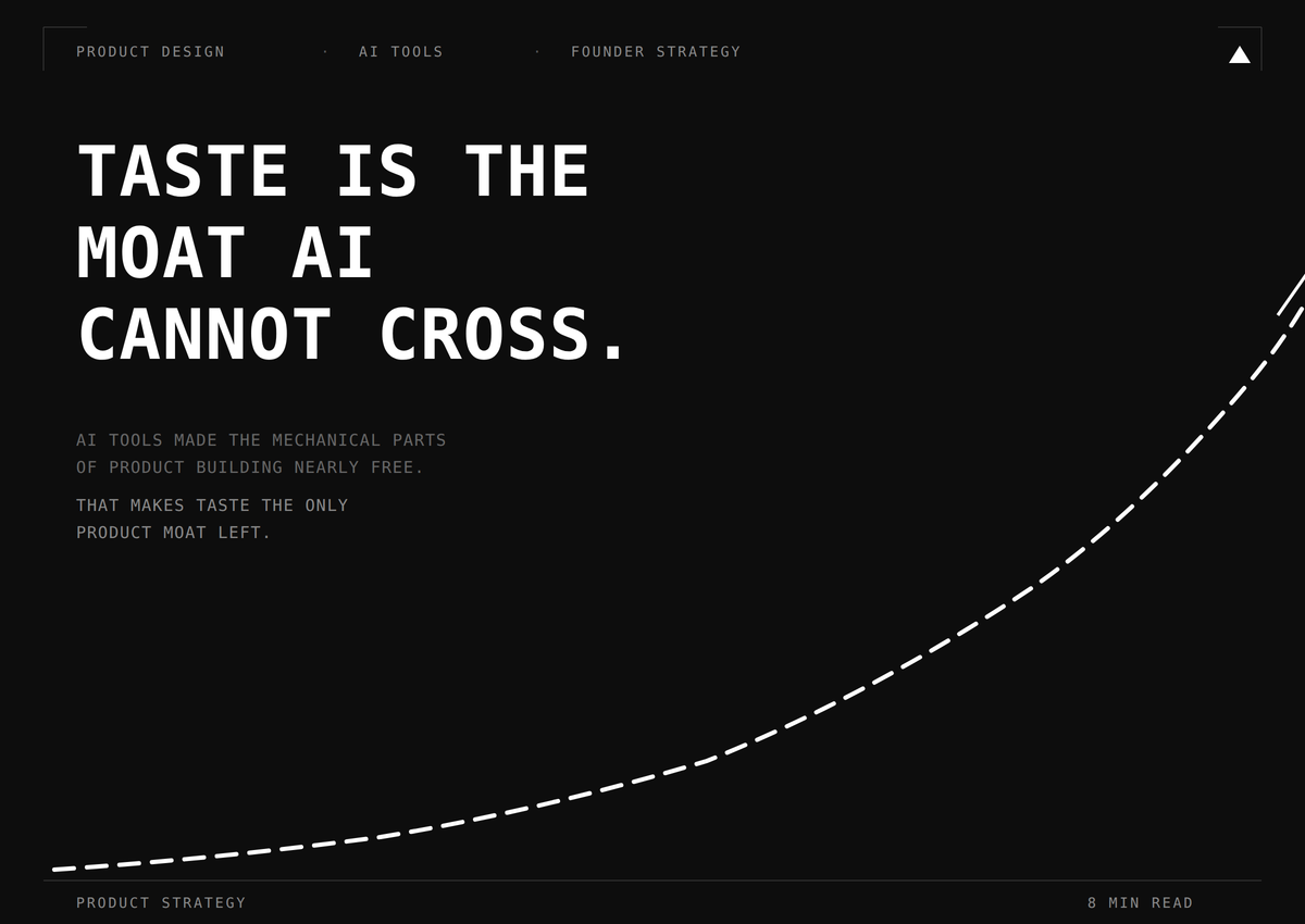
AI tools made the mechanical parts of product building nearly free. What they cannot touch is the judgement that makes a product feel built for a real user in a real market.
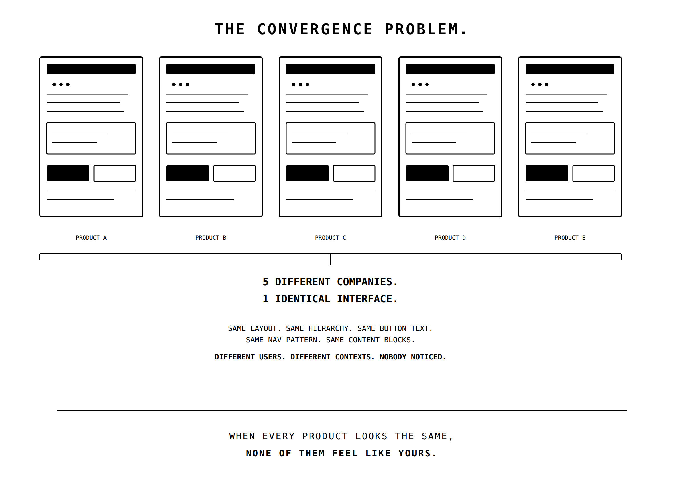
Most AI-generated products look the same. That is not a bug. It is the whole problem.
Every founder I know is using AI to ship faster. Claude Code for code, v0 for interfaces, ChatGPT for copy. I use them too. They are genuinely good. But here is what nobody in the AI hype cycle wants to admit: the products coming out the other end are converging on a single, flavourless aesthetic, and that aesthetic has no idea who it is talking to.
I call this the intuition tax. Every time you accept an AI-generated design output without questioning it, you pay a small tax on the accumulated judgement that makes a product feel like it was built by someone who gives a damn. One tax payment is nothing. A hundred of them, and your product feels like it was assembled by a committee that has never met your customer.
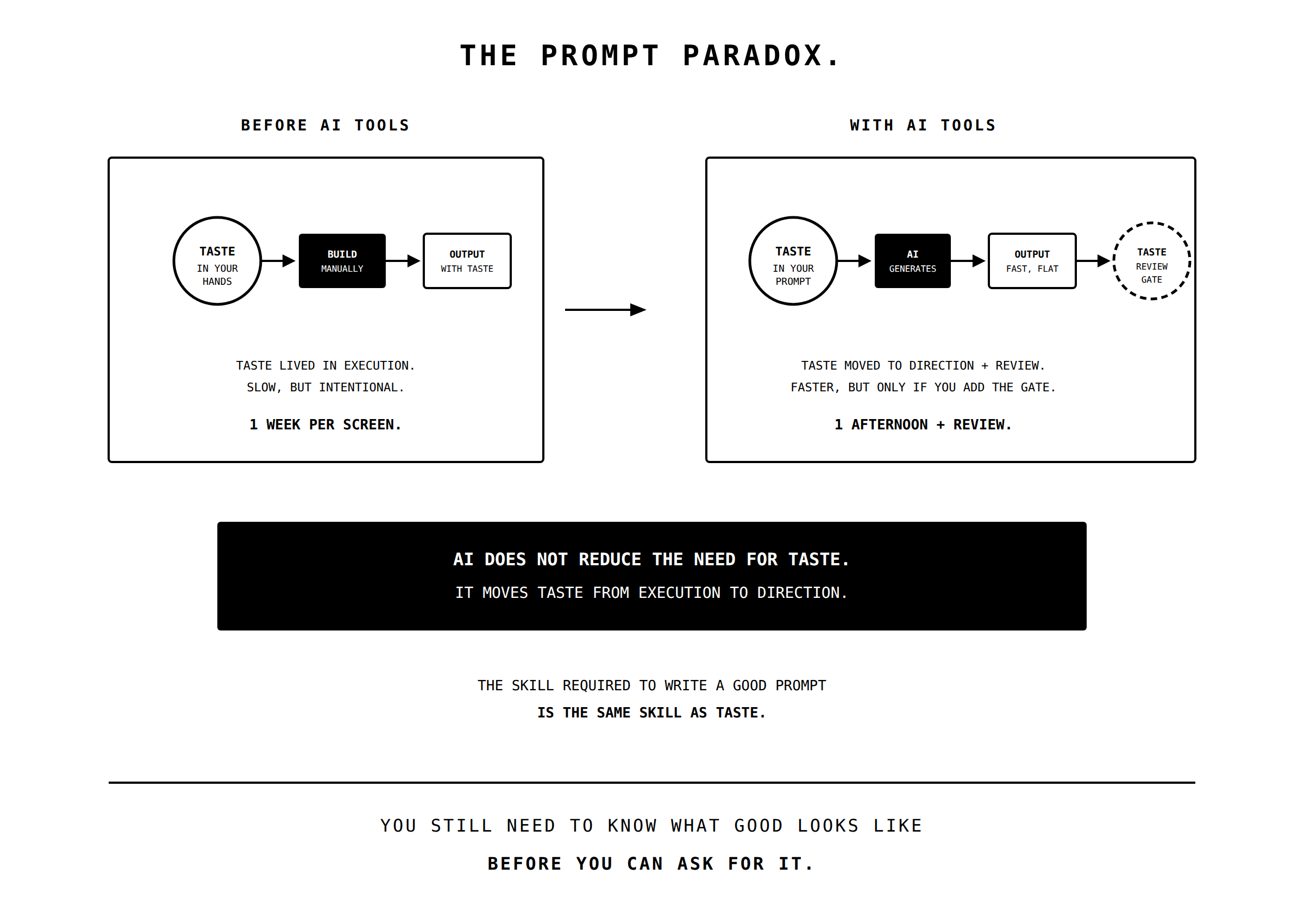
What AI tools made free, and what they cannot touch, yet
Let me be direct about what I think is happening. AI tools have made the mechanical parts of product building nearly free. Layouts, component libraries, responsive grids, basic animations, functional copy. All of it can be generated in minutes. This is wonderful, and I am not nostalgic for the old way.
But by making the mechanical parts free, AI has made the non-mechanical parts the only source of differentiation. Those non-mechanical parts are taste, context, and intuition. The ability to look at a screen and know it is wrong before you can explain why. The understanding that your user in Tembisa navigates differently from your user in Constantia. The instinct that "Get started for free" is the wrong CTA for a market where "free" often means "there is a catch."
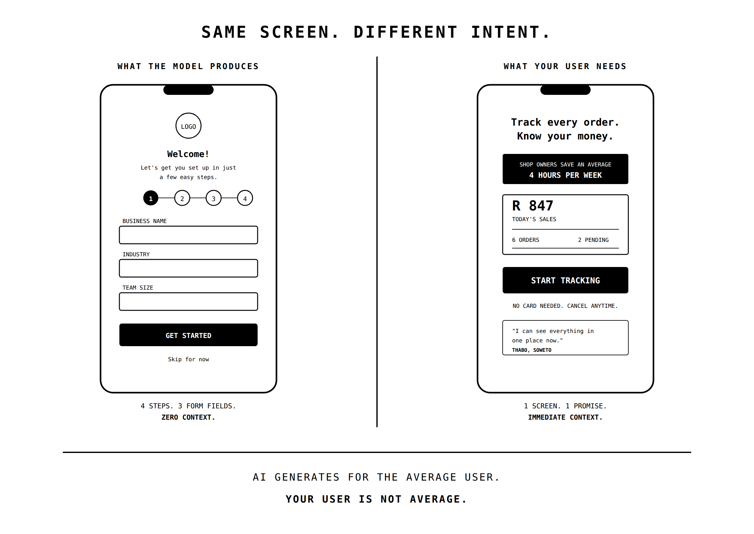
I learned this the hard way. When we were building Pasella, we used AI to generate an early version of the onboarding flow for spaza shop owners. It was clean, well-structured, followed every UX best practice. It tested terribly. It looked like every other app those owners had downloaded and abandoned. Our users were not app-native power users who trust clean interfaces by default. They were business owners who needed to see, in the first three seconds, that this product understood their specific problem. The AI gave us a generic solution to a universal problem. What we needed was a specific solution to a local one.
That specificity is taste. And right now, it is the cheapest competitive advantage available to any founder building in Africa, precisely because most teams are skipping it in favour of speed.
Three places where AI taste fails hardest
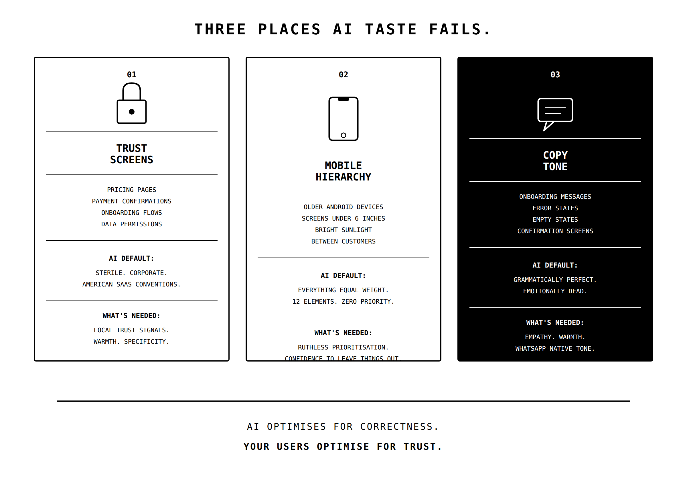
Anything involving trust. Pricing pages, payment confirmations, onboarding screens, data permission requests. These are the moments where a user decides whether your product is safe. AI outputs for these screens are almost always too sterile, too corporate, too modelled on American SaaS conventions that assume a baseline of digital trust which does not exist in most of our market. Yoco did not become the default SME payment device in South Africa by following a template. They built trust through hundreds of micro-decisions about visual language, physical weight, haptic feedback, and tone that reflect years of watching how South African business owners actually interact with financial technology. You cannot prompt your way to that level of specificity. You earn it by being present.
Information hierarchy on small screens. Most of your users are on mobile. Many are on older Android devices with screens under six inches. AI-generated layouts optimise for completeness, not for the ruthless prioritisation that small-screen design demands. The most common failure I see when reviewing AI-generated mobile interfaces is that everything is treated as equally important. Nothing is emphasised. Nothing is deprioritised. The screen is technically correct and practically unusable, because a user glancing at a 5-inch screen in bright Joburg sunlight between customers does not have the cognitive bandwidth to parse twelve equally weighted elements. Good mobile design is not about fitting more in. It is about having the confidence to leave things out, and that confidence comes from knowing what your user actually needs in the moment. AI does not have that knowledge. You do, or you should.
Copy that sounds like it was written by a person who cares. AI-generated copy is grammatically perfect, contextually appropriate, and emotionally dead. It reads like a competent employee who has no stake in the outcome. In a market where WhatsApp is the primary business communication channel and people expect warmth even in professional interactions, emotionally flat copy is a conversion killer. Stitch gets this right in their developer documentation, which manages to be technically precise whilst still sounding like it was written by someone who actually builds integrations and knows where the frustration lives. That tone is almost impossible to generate with a prompt, because tone is a function of empathy, and empathy requires having lived close to the experience you are designing for.
The argument against myself
Someone reading this will say: "This is a prompt quality problem. Better prompts, better results." That is partially true. A detailed prompt that specifies your user persona, your market context, your trust constraints, and your visual language will produce better output than a lazy one...